What’s Been Happening?
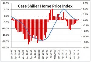
After the worst national housing price downturn in memory, residential real estate has not yet recovered. The blue trend line below tells the story. The housing slump continues due to supply overwhelming demand. Bank foreclosures provide a steady source of low priced supply while more Americans find waiting to buy or renting an attractive option. The consensus remains that it will take quite some time to offset the effects of this unprecedented debt-fed bubble. |

Source: S&P/Case Shiller Index
|

Source: NumberNomics.com |
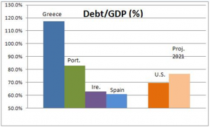
American government debt has reached a level of roughly 70% of our annual output [GDP – gross domestic product]. At this level, we find ourselves ranked between Portugal and Ireland, two of the four European countries in the news for their debt problems. The Congressional Budget Office projects that in ten years this figure will increase to approximately 77%. Other economists estimate levels in the 90% range and above if we continue on the current course. Levels above 60% for developed nations are deemed imprudent. At least the leadership in Washington DC seems to be aware of the issue and is addressing it. |
Other Trends To Be Aware Of
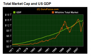
By some measures, US stocks are reasonably priced to moderately overvalued. The picture below charts 40 years of relatively steady growth in the US economy [GDP] versus a broad measure of US stock prices. If the slow recovery continues, it should provide scope for increased stock prices over time. |

Source: GuruGocus.com |

Source: Leuthold Group and Charles Schwab & Co., Inc |
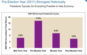
On a bright note, if the historical stock market surrounding Presidential elections repeats itself, the second half of 2011 could be very positive for the S&P 500. For the first half, stocks by that measure rose by 6% so, on average we could expect an 11.6% return for the second half to match the 17.6% average for the year prior to election year as shown by the chart below. This will be fun to track. |