What’s Been Happening?

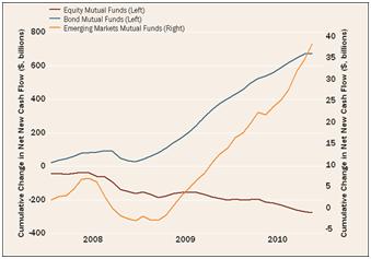
One of the biggest stories in investing is what we call fund flows. The chart to the right shows the flow of mutual fund money into three asset classes over the last three years – US stocks, US bonds andInternational Emerging Market stocks. The steep upward sloping lines indicate that in 2009 and 2010 the average investor continued to add more money into funds that had done well in 2008 [bonds and emerging market stocks] and reduced exposure to areas that underperformed [US stocks]. As we know, stocks have been much more productive than bonds since March 2009 [S&P 500 + 85%]. Investing more into what has worked well lately is akin to driving using just your rear view mirror.
For further proof that the average investor comes out behind,
we turn to research 1 analyzing retail investor’s purchases and sales of stock mutual funds. The data shows the S&P 500 had an average level of 1,171 over the last ten years while the average stock fund investor had an average cost equivalent to the index level of 1,434. This means through the timing of their purchases and sales, the average investor paid 22% more than if they had just bought and held for the 10 years.

We attempt to avoid these mistakes on your behalf by not trying to “time the market” and by remaining disciplined with our rebalancing process which calls for us to trim areas of relative out-performance and add to lagging asset classes.
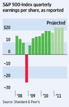
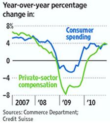
What is propelling stocks upward? Corporate balance sheets and profit margins are very healthy. Cash at 7.4% as a percentage of corporate assets is near record levels; earnings have rebounded and are expected to continue to improve [see middle chart to the right]. Also, the holiday crowds at malls demonstrate that consumers appear to be spending again as indicated by the nearby chart showing a 4% increase in consumer spending over a year ago. 
1 Source: TrimTabs using data to July 2010 from the Investment Company Institute as reported by The Washington Post October 4, 2010.
Other Trends To Be Aware Of
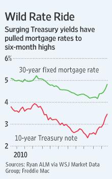
As you know, we have highlighted the low mortgage rate environment in this space in the past and encouraged clients who were able to lock them in. The chart to the right may be marking a bottom in interest ratesas they surged during the last quarter of the year. Suffice it to say, a 5% 30 year mortgage rate should still be viewed favorably. However, we believe many investors will welcome the higher interest payments attached to their money market and bond fund holdings should this trend continue.
Unemployment in the US remains high at 9.4% in December but improved from 9.7% at the start of 2010. Painfully slow improvement is expected.
During the year, weakening finances of some European countries including Portugal, Ireland, Italy, Greece and Spain was cause for concern. The Euro zone countries and International Monetary Fund responded with loans that were conditional on these borrowing nations taking drastic austerity measures. It will be interesting to see if they comply.
Inflation or deflation? Even after the Fed pumped another $600 billion into the banking system 2, inflation in most developed countries remains benign. Continued government budget deficits cause us to be concerned and remain positioned for higher inflation.
In December Congress extendedcurrenttax rateson dividend income and capital gains for 2011 and 2012. This was positive for investors as it left relatively low rates in place and eliminated uncertainty. However, since the legislation isn’t permanent, it postpones the decision for an election year.
After a slow start and a tough second quarter, most markets in the world ended the year with positiveresults. The US market indices accounted for most of top performance during 2010 while real estate investment trusts continued to produce stellar returns despite continued difficulty in the sector.
Some Numbers for Comparison: The following table compares some key indices against which fund performance is measured. All figures are for the periods ending 12/31/2010.


